His artistic innovations become a reference point for directors such as Alfred Hitchcock, Stanley Kubrick, or Steven Spielberg who asked him to create the poster for “Schindler’s List”. So let’s find out what makes Saul Bass a genius of illustration in the world of cinematography.
Who was Saul Bass
Saul Bass (New York, May 8, 1920 – Los Angeles, April 25, 1996) was an American illustrator. It grows in the Bronx, neighborhood of the big apple, together with the Jewish family who emigrated to the United States. Passionate about art from an early age, he manages to get one scholarship to Art Students College, a prestigious Manhattan school that allows him to enter the advertising world.
It starts in fact at work as a draftsman in this sector in 1942 and then became part of the great Warner Bros. family. Not satisfied with the academic path, he decided to continue his studies by enrolling in the Broolyn College where he meets the designer György Kepes, who introduces him to the works of the Bauhaus and Constructivism. At the age of thirty-two he can therefore boast sufficient education and work training to open his own design studio with the name “Saul Bass & Associates”.
Saul Bass and the beginning of his career as an illustrator
During a working day in 1954, Otto Preminger, director of well-known films, turns to him for commission him the poster of his latest film “Carmen Jones”. In love with the illustrator’s works, he again relies on him for numerous other projects that over time achieve international success. With the poster of “The man with the golden arm”, in fact, he makes himself known all over the world.

The thought that guides Saul Bass is in fact that of involve the public from the first image and in fact it can be said that in addition to winning attention through the posters, it also does so within the film itself. In fact, one of the great cinematographic revolutions it carries out is that of take advantage of the moment in which the opening credits appear, often dedicated to the purchase of food and drinks by spectators.
In fact, he claims that that moment is essential to create atmosphere in the room and introduce the audience to what is the symbolism present within the film. This technique is also being considered by many successors who understand how to make the moment of the opening credits artistically and meaningfully valid. Among his most successful works “Anatomy of a Murder” is perfect to better understand this idea.
“Anatomy of a Murder” and the contribution of Saul Bass

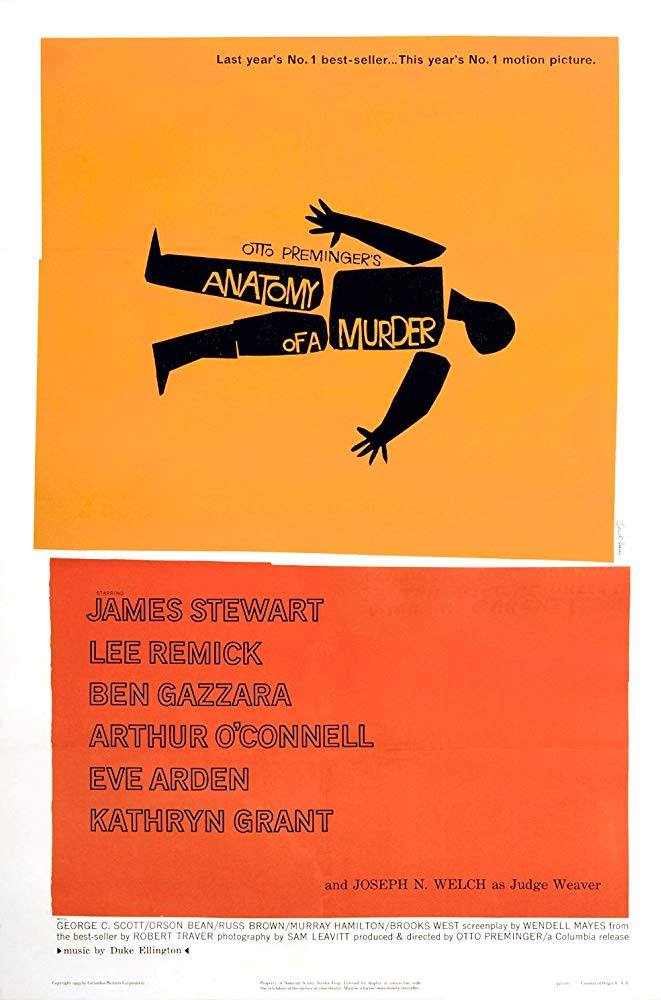
In “Anatomy of a Murder” Bass takes advantage of the same arrangement of the elements both for the poster and for the opening titles, making the image “immediately recognizable” as Martin Scorsese says. In fact, on a yellow background, a black body broken down into its parts is represented and these, very stylized, refer to the concept of dehumanization and universalization of the figure.
As anticipated, therefore, the opening titles are able to create a link and anticipate the theme of the film which concerns precisely an assassination, taking up the term “anatomy” that appears in the title. A concept that in its simplicity veils a sort of mystery and therefore makes the sequel to the film understandable but still enigmatic.
I’m numerous clues that Bass leaves within this small moment. The body is in fact divided into seven parts, an odd number that wants to refer to a sense of incompleteness, the same that is perceived by looking at the film. In the same way, the cuts of the parts are made in a rough way, with the desire to emphasize this aspect again.

